

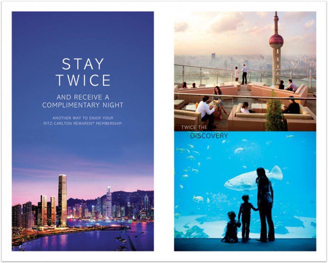
Tip-In Inspiration To Completely Customize Your Notebooks
Take your message past the book cover.
For a completely custom notebook, or as a finishing touch, we can print a custom Tip-In Page and add it to the binding of a notebook. This option works well if you want to add a lot of text or information or if you want to include a full color printed design element. Single first pages are our most popular option, but we can work with you to design fold-outs, inserts, back page elements, and more.

Canva Design School has created a list of brilliant flyer designs that can be applied to our custom tip-in options.
"We see them everyday — in the mail, at work or school, on community bulletin boards, in store windows. Flyers.
That’s right, those bits of paper that often end up in the trash, trampled in the street, or buried under a pile of bills. But if they’re doing their job (read: have been designed well), flyers should catch your attention and maybe even get you to take action (attend this grand opening; use that coupon; buy tickets to this concert — you get the idea).
Maybe you’re a business owner and you don’t want your marketing efforts to end up in the recycling bin. Or maybe you need to advertise an event or fundraiser for your club or community organization. Whatever your needs, check out 50 stellar examples below with design tips that will get you inspired for your next flyer design project.
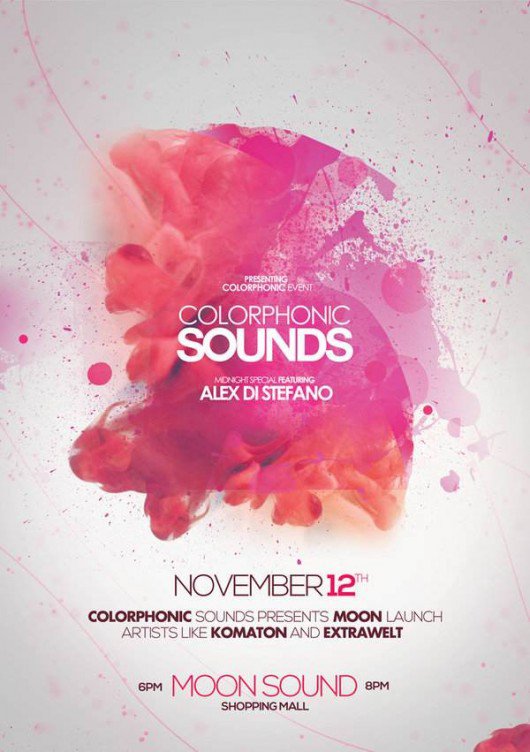
1. Embrace Color
Bright, bold color palettes really give flyers punch and attract attention, even from across a room. This design by Martin Azambuja uses vibrant hues that reflect the fresh ingredients of the dishes the flyer is advertising.

2. Mix It Up
Combining different font styles and sizes can give your flyer a distinct look and help it stand out. In this piece from Overloaded Design, 3D effects on the text and some subtle, grungy textures also make the design pop.

3. Keep It Simple
A simple, elegant design has impact of its own. As with this flyer from Valerie Jar, text is kept to a minimum and the design elements are spaced generously. The edge-to-edge background photo and clean white-and-orange centerpiece also help give the flyer an understated sophistication.

4. Blast to the Past
The handcrafted look is big right now (whether designs really are handmade or are just created to look like it). This screen-printed flyer from The Prince Ink Co. features whimsical, hand-drawn typography, which is very appropriate for a print company that runs all its prints by hand. Using a “form equals content” approach to design like this can be very effective.

5. Play With Patterns
Patterns make a striking visual statement, whether you use them throughout your design (like in this flyer by Joris Rigerl) or just as an accent. Because the human eye naturally notices patterns, including them in your design is a surefire way to get more people looking at your flyer.

6. Study Shapes
Like patterns, shapes are a great attention-getter, especially when applied creatively. This flyer by Justin Krout uses shape in both the text and the graphics. Notice how the tilting shape of the text makes for a unique and eye-catching title, while the mountain below is made up of triangles of all shapes and sizes, creating a multifaceted, almost 3D effect.

7. Work the Details
Finely detailed graphics can be stunning, but how do you avoid making your design look too busy? A limited color palette helps, as does a focus on symmetry and balance, like in this design by Kristie Kam. This flyer also keeps things polished by sticking to a visual theme — in this case, a heavy emphasis on geometric shapes and patterns.

8. Pick a Color Scheme
Choosing a cohesive color scheme (maybe the colors in your company’s logo) and/or staying in the same color family or temperature (warm or cool) really pulls your design together. This folding flyer by Evan Travelstead sticks to cool blues and grays against bright white for a clean, polished look.

9. Get Seasonal
If you’re designing a flyer for a holiday or event associated with a particular time of year, capitalize on that and use imagery associated with the occasion. Viewers will immediately relate to the design because it’s familiar or nostalgic. This design from Digital Space uses reindeer and snowflakes in a sleek, retro-inspired way that’s creative rather than cliché.

10. Make Space
Paying close attention to spacing and alignment is an important step in the design process — one that can make or break a project. See how in this flyer by Pashlov Egor, all the icons in red are approximately the same distance apart? Though there’s a lot going on, everything fits together nicely, almost like puzzle pieces, without looking crowded.

11. Rough It Up
Designs that are textured or a little rough around the edges can be a nice contrast to all those more slickly produced flyers out there. As with this hand-carved block print by Jack Daniel Bagdadi, sometimes designs (much like people) are all the more appealing and dynamic for their little imperfections.

12. Lead In
Take a page from art class and use the concept of leading lines. A common composition trick in art and photography, leading lines are just what they sound like — they lead in to the part of the image that the artist wants viewers to focus on. In this design by Macrochromatic, the diagonal lines of the mountains intersect with the sides of the red triangles to form arrows that point right at the band’s name.

13. Point and Shoot
For designs that feature photography, choosing high-quality, visually appealing pictures is a must. In this advertising flyer, Jackie Lay makes the photos the center of attention, selecting images that draw viewers into the scene.
14. Take Risks
Using unexpected color combinations, like the aqua and magenta pairing in this flyer by Joshua Benedikt, will be more likely to get a second look than designs that play it safe with color choices. Don’t be afraid to experiment with color — you never know what might look good until you try it!

15. Go Dark
A predominantly dark color scheme with bright splashes of color adds extra pizzazz to any design project. This noirish piece by Pretty/Ugly Design gives off a mysterious vibe with black and white elements, while the swash of red adds drama.

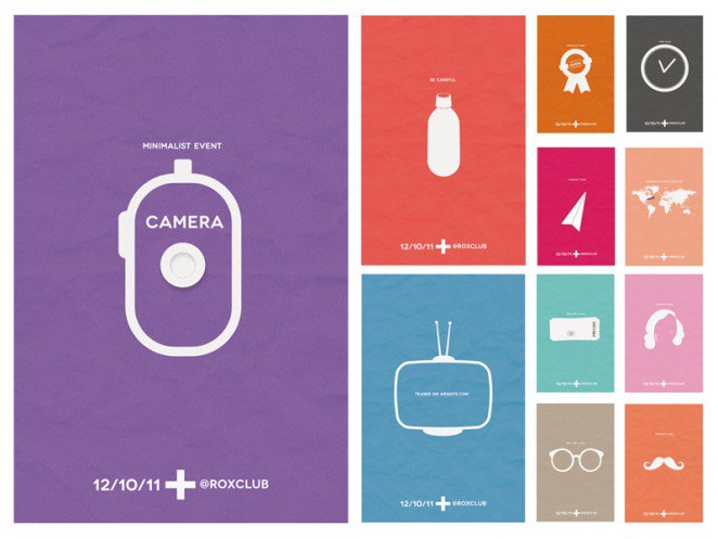
16. Make It Minimalist
Want viewers to laser in on your flyer? Try a minimalist design. There’s a reason big, successful companies like Apple embrace minimalism in their design aesthetic — It’s effective. It’s sleek. People like it. Take this series of flyers by Barthelemy Chalvet: the focus is on a single image surrounded generously by negative space; content is stripped down to only what’s necessary; the font is simple and clean.
17. Find Balance
It can be tricky to make sure ornate designs are composed well and easy to read — but it can be done, and with impressive results — for instance, this hand-illustrated flyer by Joel Felix. If you’re considering a flyer design that features lots of details, good spacing, symmetry, and a plain, single-color background will help you go from busy to balanced.
18. Layer Up
Layering different elements of your design can help you fit more information on your flyer, while creating a striking composition at the same time — a win-win. This design by Steve Wolf layers multiple design elements, including text, while keeping everything readable. The result: an unusual and eye-catching layout.
19. Go Old-School
Remember when (before we had cell phones to remember phone numbers for us) there were those flyers that had tear-off tabs — little strips of paper with contact information on them? This flyer concept from Glenn Jones revisits that idea, with amusing results. When you can infuse a sense of humor into your designs, they’ll be more memorable.

20. Get Artsy
Including design elements inspired by traditional art mediums — whether paint splatters, watercolor splashes, ink drawings, or something else (real or digital) — can give your flyer an extra-creative looks that feels custom-made. This colorful example from Dussk Design layers different textures from the same color family in a way that feels spontaneous and energetic.
21. Block It Out
Want to draw attention to a certain part of your design? Try placing it on top of a block of color, which shows that that area is important, especially when you use a loud color like red or yellow. In this example from Rich Scott, the red area highlights the key information: the brand name, the website, and that magic word: FREE.

22. Offer an Incentive
If you’re creating a flyer hoping that your audience will do something when they receive it, it’s a good idea to offer an incentive. It could be a coupon or a free gift (or both, like on this flyer by Blake Thomas) to get your audience to engage with your brand. This design also has something else going for it: it pairs blue with an orangey, golden hue — and blue and orange are complementary colors (or opposites on the color wheel, which artists will tell you always make a striking contrast; think red and green, purple and yellow, etc.).

23. Think Outside the Box
One of the best things about designing a flyer is that you can let your creativity shine. Of course, different projects will have different guidelines and requirements, but if you find yourself in a situation where you have free rein, use it. The mountain of green monkeys in this flyer by Sander Legrand may not be the first illustration idea that occurs to most of us… but you know what? It works.

"So what can we take away from all these examples? Let’s take a quick look at a few basics:
- Typography: There are countless font styles out there, but be sure to pick one (or more, but not too many) that suits the purpose and/or theme of your flyer and is sufficiently readable.
- Layout: Pay close attention to things like alignment, spacing, and balance when creating your flyer design. They make the difference between a polished final product and a confusing or cluttered design.
- Color: When you’re having trouble choosing a color scheme, consult a color wheel. Complementary colors (opposites), color temperature (warm or cool), and other art-inspired concepts can help you pick a cohesive color palette. Remember, colors can influence mood and perception, so make sure yours match your flyer’s intent."
(Via Canva)